The way colors are placed together creates a conversation and motivation that our bodies understand. We respond below the level of our conscious awareness to the colors and how they are used in a room.
There are a few ways to create a calm room with color as well as with variation of tone, value or saturation. You can do this without knowing the glossary of terms used above (if, however, you wish to claim your stake as a color professional, it’s a good idea to be able to properly use color terms that we cover in the Exciting Colors! Color Certification Course.).
For now, let’s look at how to create calm or excitement in your clients’ rooms, just using color.
To create calm Keep the color tones similar and don’t vary the tints, shades or tones too widely. (tint=add white to the color, tone=greyed version, and shade=add black to the color).
1. Use a monochromatic color scheme which means using variations of the same color. Mono=one, chrome=color. Kelly Hoppen authored a book called Monochrome Home. It’s an exploration of contemporary calm (not all of it is good Feng Shui, but that’s another story all together).
“Monochromatic” could mean your room has shades of beige all the way from very light beige to a deep chocolate or shades of blue sky and sea, colors of cottage greens or even greys or periwinkle. Calm will also be imparted with the specific color, where as a monochromatic room in reds will have a certain feeling of calm but the red color will lend itself to action and vibrance.

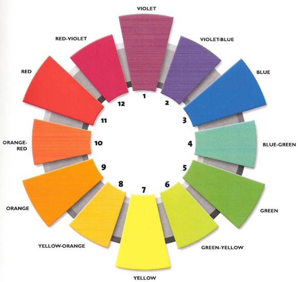
2. Use an Analogous Color scheme. For this we refer to the Color Wheel and look to use colors that are next to each other. For instance, we’d use blue and green, or yellow-based and orange-based colors.
3. Use cool colors for a calming, relaxing environment. Just think of the color of the ocean and sky, those greens and blues are restful to our bodies and minds.
4. Use soft, warm colors for creating restful nourishment and intimacy: rich, warm beige and tans are great colors for a couples bedroom or for a family room and kitchen where nourishment of food and friendship are the hallmark.
To create excitement in a room:
1. Use colors opposite each other on the color wheel. These colors, called ‘complimentary’ create a vibrant exchange. For instance, yellow and purple, orange and blue, or green and red are exciting. (See color wheel above.)


Color is light and our bodies respond physically to light in all its variations. When choosing colors, you’ll now know more about the impact they will have on the outcome your client wants to experience in her rooms.
If you’d like to learn how to become an Exciting Colors! Certified Color Specialists and learn to use and market your business using Color click here or contact me. Learn to become a color specialist or use this service to increase your business easily and conveniently through our online classes. Check us out! Exciting Colors! Certified Color Specialists