Back in fashion and home décor is Color Blocking but you can get it wrong!
Color is BACK and one thing we are seeing quickly on its heels is a design process called ‘color blocking’.
Bright colors are everywhere. It’s our way of telling ourselves: “I’m ALIVE!” The past few years have been hard on all of us and the bright colors we see are actually helping us stay positive and move forward after assessing what is really important in our lives.
Color blocking is a way to use bright, happy, saturated colors and have a design that looks spectacular. Whether in wardrobe or a room, there are a few secrets to successful color blocking.
1. Use color of similar “value”

“Value” when referring to color means lightness or darkness. Colors we see aren’t always made of same ‘shade’, ‘tone’ or ‘tint’. Either tinted’ with white or ‘toned’ with grey or ‘shaded’ with black, colors vary and to get it right look for a similar value. To successfully color block, chose colors that have a similar lightness or darkness to them, the same amount of brightness, muted-ness or darkness.
2. Use less embellishment

Accessories and ‘house jewelry’ should also be bold so long as they are not overly fraught with flourish. In this photo, the bedding is almost too much. The idea is to focus on the colors and how they work together and voila! you have created a great statement.
3. Lead or Hide: Look at the Shapes and Where They Direct Attention

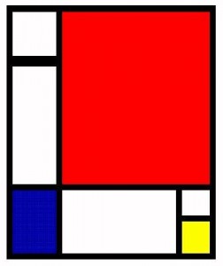
Colors form shapes and lead the eye to camoflage or accent: be careful! Much color blocking is rectangular and some is diagonal.
Because color and shape are used to direct the eye, it’s important to know where you are placing the emphasis. Draw the eye toward something or away from something you can use color to create a restful experience or a dramatic, exciting one.
Dark colors will usually make something appear smaller but also heavier. The lighter colors are the ones we notice first and also tend to make us think something is larger and lighter.
Whichever colors you chose, if you follow the next rule, you’ll be sure to have a successful design, whether it’s your wardrobe or your room.
4. Keep it to 3 ‘Colors’

The key to color blocking is to have blocks of color in some geometric layout, even if you do use blocks of color that are round or oval. Unless you are an expert or extremely adventurous, try to use at most 3 colors, in addition to black, white, grey or beige (as the neutral accent).
As a rule, you can add more color to a room or outfit, by limiting the amount of white you use. And be careful of ceilings: paint the ceiling a color too can make the room look complete, which leads me to the next tip:
5. Remember the ceiling

Many of us think because the paint can says “Ceiling White” that we must paint our ceilings white. “Not True!” The ceiling is one of the most important walls in the room. Painted white, it can have an adverse effect on the colorful design because it will seem out of place and seem like you are wearing sneakers with a ball gown. If that’s your style: great, but if not, you are not getting the best room possible. Use a tinted version of one of the colors in the room to make the ceiling match, or, like in this photo, go wild and make a statement.
Color blocking is one way to use dramatic use of vibrant color to make a statement, bring expressive and vibrant jolt to a room or a wardrobe. Why is it so popular now? Because we are needing color and it’s one way to get a big dose of joy!