Many of us think of light and color as static and stationery. In fact, both are constantly changing. It is this subtle but constant change in light and color that is vital to our body’s ability to stay healthy.Sure, most of us understand the fresh and free feeling of walking outdoors, sunlight touching our skin and fresh air inspiring us. Nature offers us a dose of Vitamin Color: “full spectrum” lighting including all wavelengths in sunlight that are necessary for full health.Not only do we need color, but we need colors in specific timing throughout the day which signals our bodies to access the natural rhythm for health and well-being. Complex chemical processes occur that keep us healthy, help our bodies build bones, adjust our mood, our sleep cycle, our hormones and digestion. But for many of us, days and nights are spent in artificial lighting.
Light and Color Moves
Understanding the link between light and health, designers and engineers around the world are taking a good look at how paint colors and lighting systems can be made to nourish our bodies in the way that Nature does. Light and color that changes with the cycles our bodies expect during the day and year, is something we need to address if we are to design a healthy environment. The 4 Tips at the end of this Post will help you make it easier to get it right.
Life is Simple, Nature is Complex
Manufacturers in Europe are developing lighting that changes during the day to return balance to our physical systems that have evolved over millions of years in Nature. Color too is evolving. Paint, lighting and glass companies now are looking into how to manipulate light and color, in order to make our indoor “stationery” light environments feel more natural.
A “full spectrum” or ‘complex’ paint color uses as many as 16 pigments blended in the paint base, using no black. Various formulations use the rich mineral pigments that give a bit of yellow, some red and some blue and voila! you’ve got the potential for thousands of colors that will bring all the color frequencies into the room you are designing. [For instance, in a north facing room (predominance of blue light) or with little or no natural light, such as the basement or interior powder rooms, it’s important to use paint colors has a yellow undertone, even if it is red that brings borders on rich spice colors like raw saffron or chili pepper.]
Colors made this way, by blending the purity of the hues, offer a rich shifting and a perceived depth to the color. The color seems to have a subtle beautiful presence that seems to adapt and change to depending on the light and other colors in the room.
In our ExcitingColors! Certification Program, we get the chance to play with colors and see just how these colors are made, beige with a green undertone, or red with a subtle blue base and more.
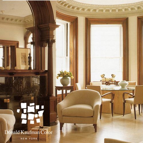
Creating a color that will have layers of component color isn’t easy, but the result is spectacular. One of my color heroes and a pioneer in the field of the richness of “complex” colors is Donald Kaufmann, whose radiant colors and color application theory bring luminescence to painted rooms. He and his wife, Taffy Dahl, have developed a beautiful color palette and written books about how color changes based on the time of day, the atmosphere and how to use color to speak to our natural selves.
Others, from West Coast based Devine, to Benjamin Moore to PPG Pittsburgh Paints, are seeing the “light” and benefits of developing paint colors that are complex and ‘full-spectrum.’
When the colors and lights shift, our eyes and our bodies to feel the freedom and flexibility of being in the natural environment.
4 Tips for using Complex Colors
1. Test the colors in the environment and at the time of day the room will be used. It is very important. I tell my clients that if they don’t test, I am not responsible for any error. Colors shift with light and you’ll want a color that is precisely what you all planned.
2. Be sure that all the décor items are together at the same time. Each item bounces light and color around, changing the perceived colors of everything else in the room. Get them all together under the same lighting and see how you experience them.
3. Use the biggest paint sample you can find. Using a larger ‘swatch’ is very important because color changes depending on the amount of color you get into the room. Especially yellows—which are a ‘self-compounding color’ and the volume turns up exponentially with the more you get in the room. Recommended: take a poster board and a quart sample and paint two coats.
4. Place samples next to the items that will be in the room. Colors change depending on what they are next to and a color next to a ‘white’ wall will not look the same as the new color next to the upholstery, window treatments or flooring.
Check out these books (from my personal library) for more ways to use Complex Colors:
Color and Light: Luminous Atmospheres for Painted Rooms, Donald Kaufmann & Taffy Dahl
Color Palettes: Atmospheric Interiors Using the Donald Kaufman Color Collection, Donald Kaufmann & Taffy Dahl
The Power of Color: Creating Healthy Interior Spaces, Sara O. Marberry