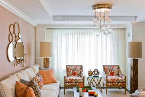
Artful Expression: Vibrant Color and Pattern Popular 2013/14

The 2013/14 Artful Expression palette is pure energy and an eclectic mix of traditional, contemporary, and multi-‐cultural references in bold and dynamic palettes and prints….
Color and trend forecasting is big business. Forecasters reference global zeitgeist in social, cultural, economic needs sometimes 5 years out. This information helps manufacturers meet the needs that we’ll all be feeling.
As you may know, color is one of those intangibles that not only drive each of us to make a purchase but will deeply answer a true emotional need within us based on who we are and what we are experiencing in our lives.
One of 5 core themes identified by PPG Pittsburgh/Porter Paints Global Color team as being the colors and design cues that we’ll be wanting to surround ourselves with and begin to see across multiple industries.
The other 4:
Every Day Hero – which portrays the design aesthetic of a low key, eco-friendly hipster with a penchant for smart, functional basics….
Illusion – a playful theme of fantasy – some childlike, some a bit more dark and dramatic…
[discreet] Luxury is a contemporary classic take on design that embraces both masculine and feminine ideals…
Modernist Tech is pared down and fashionable with the added appeal of futuristic-technology.
Color trenders explore the needs of a variety of lifestyles and each particular character, and understand the color palette and design details unique to each; details and colors that are interpreted across industries: home furnishings, automotive, tech products, architecture, and more.
The living space for the Artful Expression theme has either a mildly bohemian take on transitional styling or leaves transitional styling behind to offer a look that is much more contemporary. Either way, sunny yellows and soft melon orange hues pair with craft browns to create an earthy and optimistic vibe amped up with geometric patterns and striking colorways.
Returning to the bohemian art spirit, this look plays up some of the 70s era references. String art, crochet references for home furnishings, and hand made pottery all give this environment a touch of hippy-‐ commune living. Patterned wall tiles returning to other areas of the home, free of being limited to bathrooms and bedrooms. Wicker, wire, and knit open work create an artistic spirit, but are kept fresh and contemporary when paired with masses of white.
 The artful kitchen does not shy away from color, and this year we see more and more brands embracing bold color stories for big ticket kitchen items -‐ suggesting that consumers are becoming more open to color long term. Rich oranges, greens, blues and yellow work together to create the perfect eclectic ensemble.
For kids rooms, the First Artful Expression direction is great for boys and girls in the 3 -‐7 range. Transformable and interactive furniture encourages engagement and helps improve navigational and manual dexterity skills.
For the outdoor space, creating a sense of Bohemia from an almost monochromatic range of beige-‐y browns. Rope seating, basket weaves, and crochet mats all serve to complete this look — surprisingly, the bolder colorations shown here are the more contemporary option for outdoor.
This trend is really all about intense color weaves in grid-‐like patterns, paired with graphic geometric prints and patterns. Melon oranges and tangy yellow-‐greens are essential, as is open work.
Join me on Houzz with Exciting Colors! to view more beautiful rooms in the Artistic Expression Design & Color Trend for 2013/14.


