Where NOT to Use The Color of the Year: Purple


Beware Purple! Beautiful, rich and luxurious and historically been with wealth, spirituality and royalty, purple used without knowing where and how can see you up all night, or at least most of it.
The trend color for 2017, purple and it’s little sister, Violet, have a dramatic influence on our mood and behavior, even our physiology.
Purple: A Little Goes a Long Way
Purple (indigo) is the color associated with meditation and our third-eye chakra–purple will allow us to be alert and also self-aligned. Unless you are In a room where you will spend lengthy periods of time, wanting deep sleep or wanting external focus, it is a color best used in small amounts or for limited periods.
Purple, in its many iterations, can be stunning but can have a negative effect on our behavior and bodies if not used with this in mind.
Violet is a softer version of purple and associated with transformation, again a self-absorptive endeavor.
Color Trends of 2017 are seeing the influence of purple, not just as a wall color, but also all sectors of manufacturing, automotive, fashion, home goods, even in tile and wood flooring. It’s a beautiful influence, and when used as accents or fashion it can be tender and fun. As a room where you will spend a lot of time: not-so-much.
Recent survey study of by Travelodge UK found that those who sleep in purple bedrooms get the least amount of sleep of the 2000 Britons polled.
What does that mean? Purple revs you up and calms you down at the same time…after a little time, purple can be irritating because our bodies AND minds are over stimulated.
It’s also a color that will tend to create a self-absorption. Violet, a softer paler version of purple is often preferred by pre-teen girls, and why not? At that age it is at best a challenge to navigate the transition from little girl to powerful woman, hormones, school and love.
The report says: “…the least favoured bedroom colour schemes for obtaining a regular good quality night’s sleep are purple, brown and grey.”
“Britons who sleep in a purple bedroom are, on average, only getting five hours and fifty six minutes sleep per night.”
How to Use Purple?

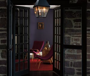
Use Shadow, Benjamin Moore’s Color Of the Year 2017, where you want to make an impact that will speak of luxury, but also rooms or spaces where you won’t spend a lot of time, like for instance an entry way, a stairwell, behind a piece of art on one wall, a powder room, a dining room (aubergine can create a stunning dining experience when paired with a balancing and nourishing gold and enough lighting).

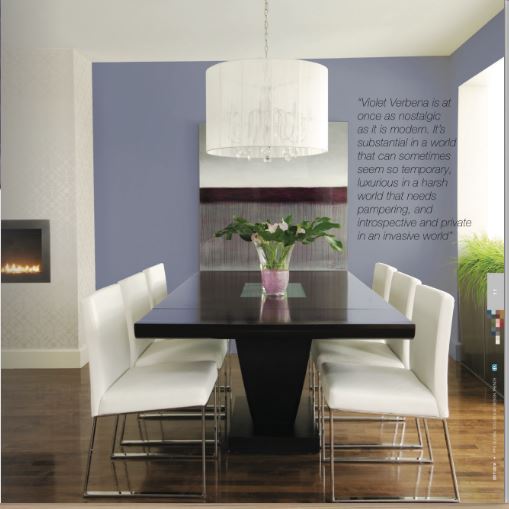
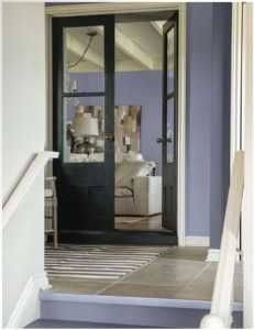
Use Violet Verbena, PPG Paints Color of the Year 2017 in rooms where you want softness and to a bridge between genders, but remember the bedroom caveat: you’ll sleep less and be less likely to relax. (By the way, this doesn’t mean you will be having more sex. For that, people whose bedrooms were caramel colored or beige were the winners in that area.)
It’s Not About Just One Color
Purple can be a lot of fun, and to use it well, make sure that the other colors in your decor have the same value tonality (lightness/darkness or saturation). Deep purple will look stunning with gold accents, and black trim, and carefully selected “white”.
Soft Violet Verbena can look fresh with a soft white and a tranquil aqua-green, with silvery gold accents.
Can you feel it?
