
These color and design themes may not speak to you right now but you’ll begin to see these color schemes everywhere…now you can be on the leading edge. Color is tied to our emotions and culture and you can get an idea of the emotional nature of where, as a society and global culture, we see ourselves going in 2013 and 2014. Where the history of war and conquest shows us some of the darker nature of humanity, the history of art, color and design can give us insight into what is inspiring us, and how we strive for beauty and to be surrounded by those colors and furnishings that help make sense of the world around us.
Color is medicine for our spirits. 60-95% of our decision to by something is based on it’s color. We choose those colors based on two basic things: what is going on inside us (memories, emotions, feelings) and what is going on outside of us (economy, our generation and socio-economic group, our friends, family and co-workers). Whether it’s a car, a laptop or cellphone, or your coffee mug and linens—all come in colors that marketers know drive our decisions to purchase a product or not.
William Butler Yeats is quoted, “We are happiest when for everything something inside us, there is a corresponding something outside of us.” We want our wishes and our personalities to be expressed in the designs and colors we live with, work with and wear and drive…and they are.
“Color & design stories” are based on people. Marketers develop ‘personas’ to give names and faces and personalities to segments of the population. This helps marketers address the needs of real people; it also helps marketers and designers determine the styles and colors that will appeal to individuals of a certain genre.
The 2013-14 color trends reflect what is happening on a global scale. As we become more regionally sensitive, more aware of nature and the world around us, and more in need of fantasy, expression, and escape from things we cannot control, trends move towards colors that help us downshift into delight more quickly when we arrive home or even at our offices and the things we buy to get from here to there. Colors, toned yet rich, are at the forefront…not so many clean brights, we are needing vibrancy with softness around the edges. Some palettes are subtle with and surprise and interest is added by a brilliant green, aqua or salmon color; others are sultry and given levity with copper, silver or jewel tones.
Let’s look at the 5 themes as defined by PPG for their Global Color Market. Which “type” do you fit into? Which of these would you like to live with?

Check these out and let me know what you think? Can you see yourself living in these styles and colors? You may not now, but in a few months you’ll be surprised.

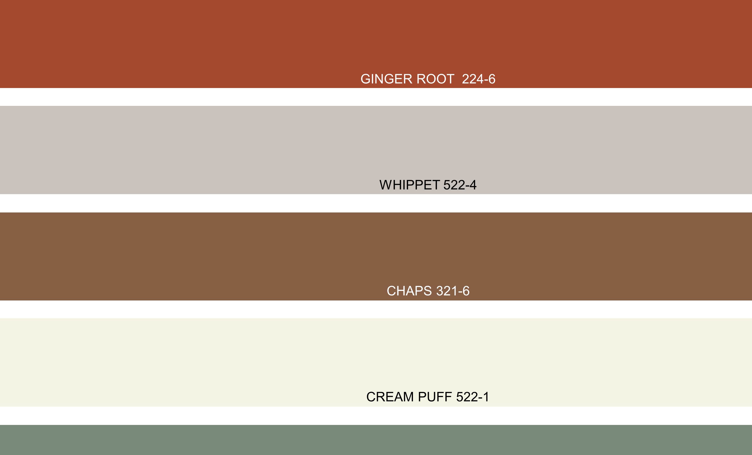
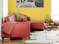
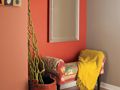
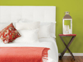
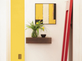
Everyday Hero is a design and social aesthetic as our culture moves into a more casual expression of life, and solutes the joy of working, whether on Main Street or Wall Street. Earthy, terracotta orange hues, cornfield yellow, lichen greens and warm grey act as neutrals basic denim blues are essential.
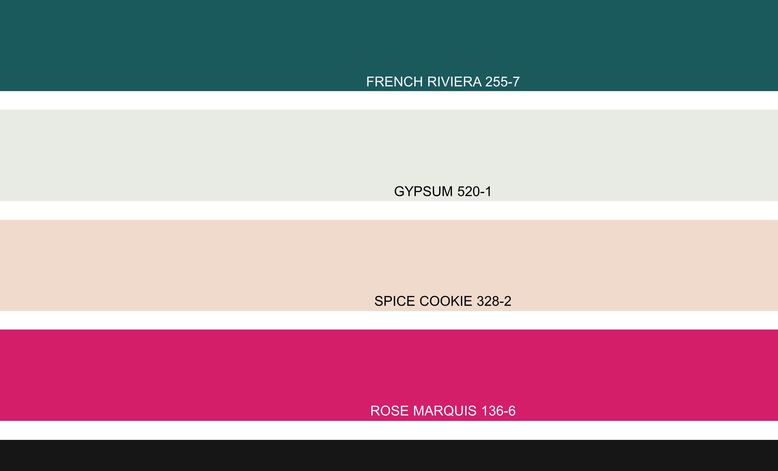
 Illusion is for those of us who, in one room or in our entire house, condo or urban loft want to touch fantasy. It’s a palette full of contrasts; 80s brights – sharp fuchsia and magenta play against hues of teal dark plum and lilac are dramatic against midnight black fleshy pink, metallic blush, and tinted white ground the palette.
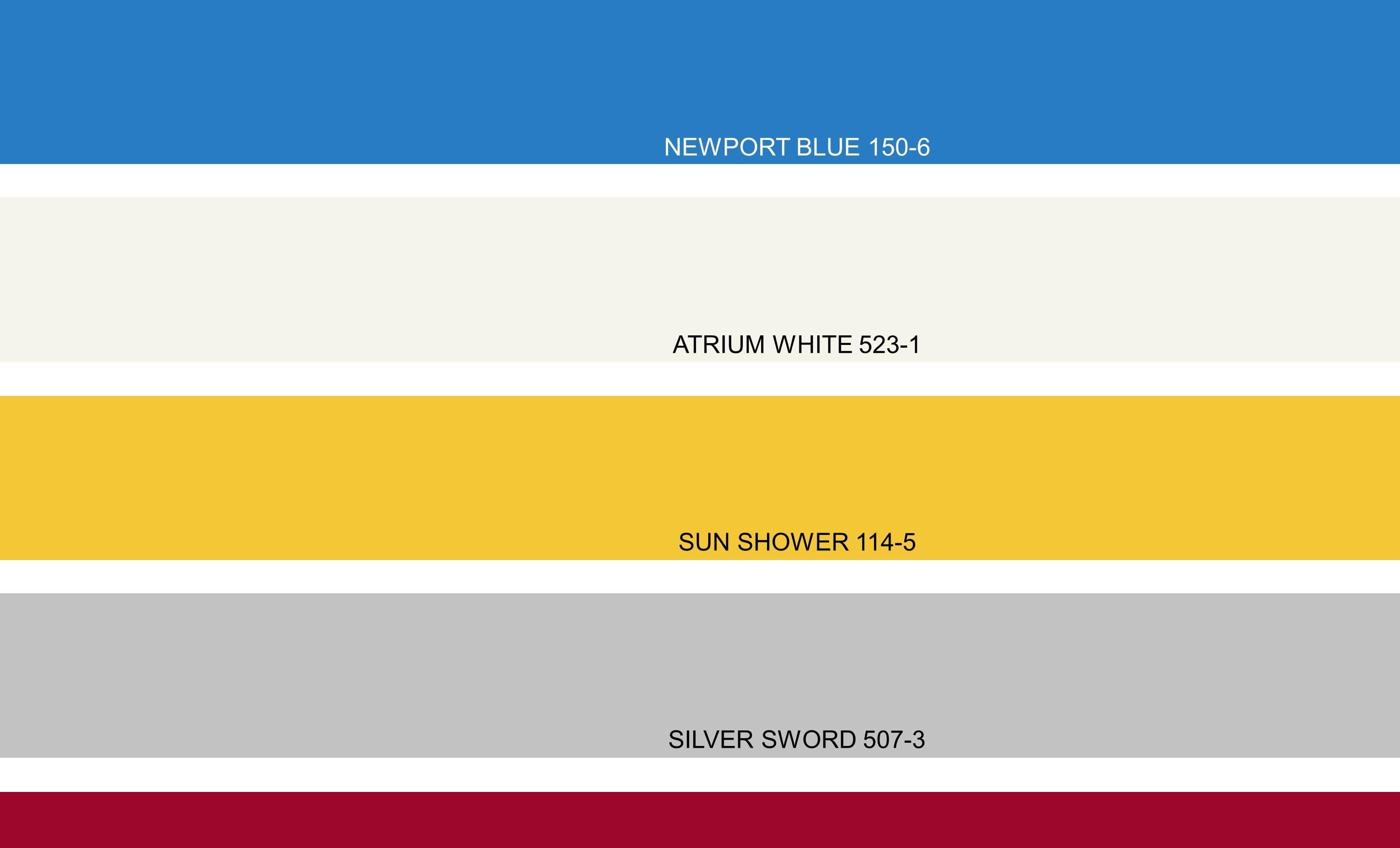
 Artful Expression is a modern, global version of Bauhaus with artistic tribal patterns and up-to-date colors—blocked colors and simple design is on the forefront. Vibrant and energetic palette comprised of mid-tones and brights in hybrid hues, mustard yellow, and moss green, kelly green, teal, and sky blue, reddish oranges, purple-reds.
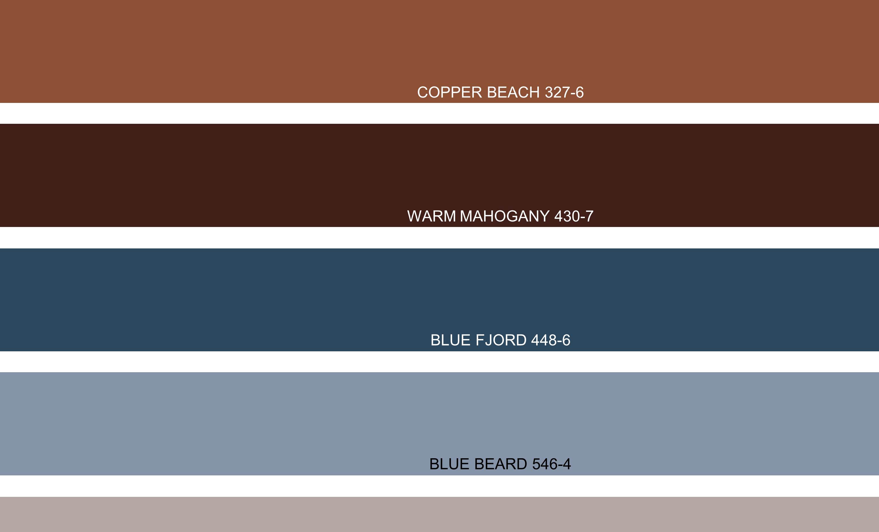
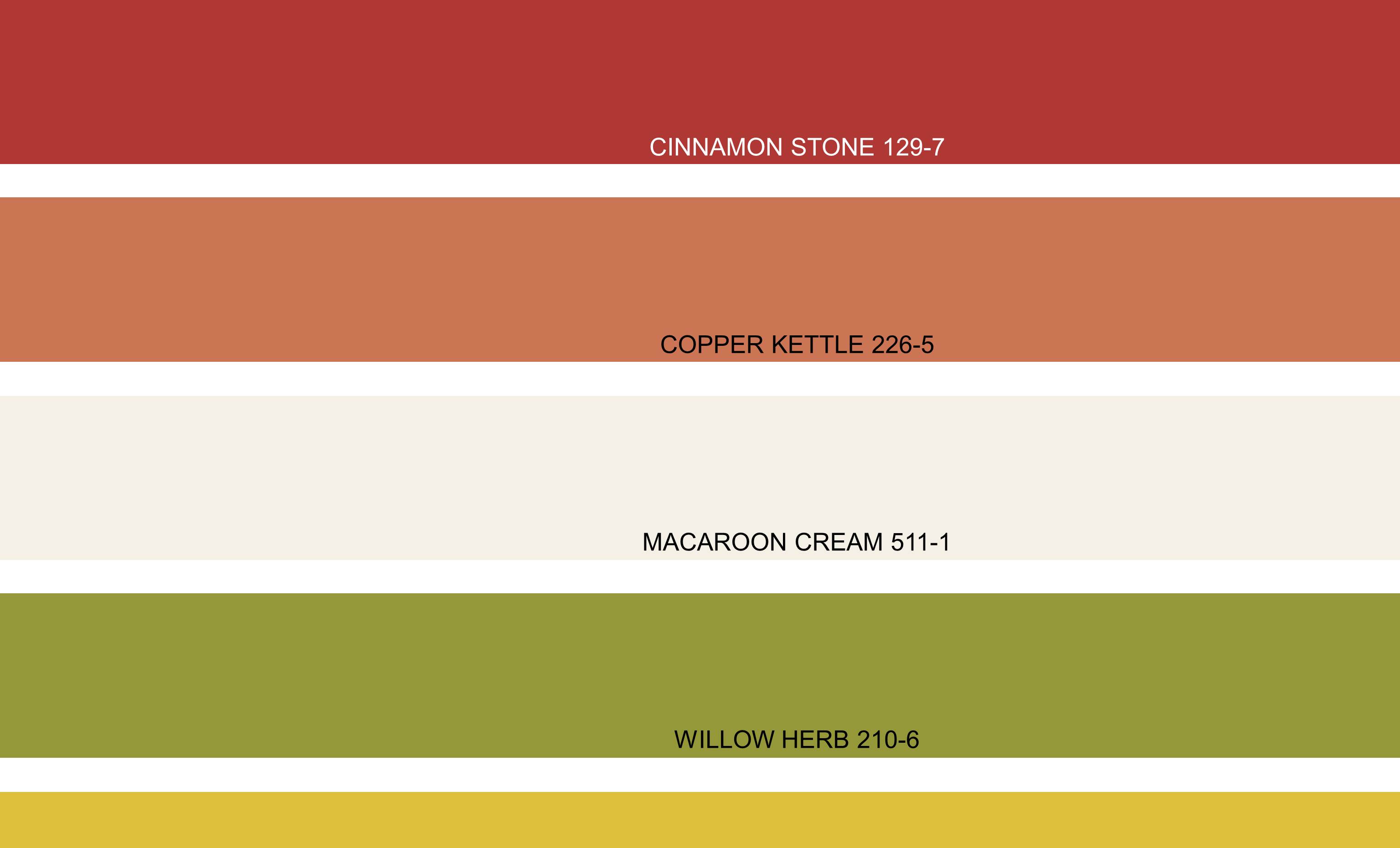
 Discreet Luxury rich, bold and understated…contemporary with classic details, this segment embraces both masculine and feminine in our love of rich luxury with modern day global sensibilities. In design and in color, sumptuous browns dominate the palette, from dark chocolate to cinnamon to soft mink …rich, rustic red and metallic copper and gold add elegance faded black and delicate pinkish grey add a touch of timelessness
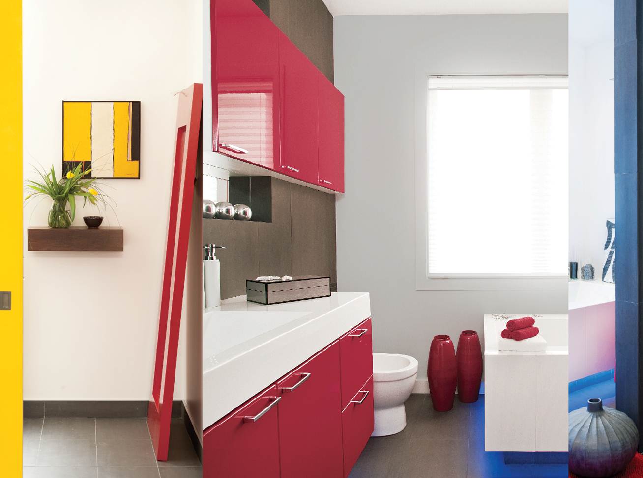
Modernist Tech is futuristic, pared down, bare-bones luxury where design and aesthetics become one. This palette is primary and literal–easy to imbue spaces with blocks of color and simple tribal pattern. Primary red, yellow, and blue take a slightly darker turn soft neutrals ground the palette khaki green and pale cosmetic-peach add a touch of the unexpected.
How long before your clients might ask for these? There’s a way to know based on where you live and the socio-economic range of your ideal clientele, when they will be on board with these or any trends.
Become a Certified Color Specialist and become an expert in your area. Whether you are a current design professional, or would like to break into the decor and design field, learn how to expertly offer color consultations that will easily increase your profits, referrals and average sale! We make it easy for design professionals to add color savvy and market with color to increase your business and enjoyment!