
Many in my audiences are women who want to know how to bring warmth and romance into their lives and relationships without being overly fussy and well, feminine…The fear: masculine folk might not feel comfortable in an overly feminine, pink or pastel room.
I always recommended that they stay away from the overly “feminine” design and colors (a lot of pink) if they want their masculine partner to feel comfortable in the room.
As I was saying this, I heard immediately from one forty-something gentleman in the audience who stopped me mid-sentence and said, “Oh hell no! I am with myself and these guys all day, I want to experience softness and beauty at the end of the day.”
That was a defining moment for me, and I am very grateful…but not totally wrong, because what is frilly and overt to one person, may be overwhelming and repulsive to another….too much of a good thing will work against you.
So how do we use design to create a bedroom that will do what it’s supposed to do? Invite sleep, rest, rejuvenation, and reconnection and most of all romance and tenderness?
Design brief to begin to make the difference
Our style broadcasts our personality –but it also speaks to us, directing our behavior based on the color, items, patterns and art.
“Softness and beauty” have as many interpretations as there are people. Adapt these ideas and you are on track:
Design:
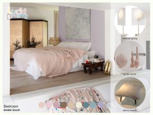
Soft pastel colors, with minimal contrast are about as feminine as it can be and as restful.
There are many versions of the ‘perfect’ bedroom and knowing how to eliminate decor that our bodies interpret as stressful will add years to your life and help to your keep your relationship beautiful.
Best wishes always,

PS If you want to know more tips and tricks, the background and the science behind the design for brilliant living, sign up for my newsletter, take a course or email me to find out when I’ll be speaking near you.