
Yellow is the Happiest color on the planet but the hardest to get right. It will turn you from joyful to cranky in a sudden moment, often without warning. It also has probably the most literal references to how it affects us of any color: “yellow bellied” being one of them.
Caution: Too much Yellow for too long can be similar to being around a ‘way-too-happy cheerleader’…you know the experience. It can quickly turn us into crabby people, overstimulate digestion, make us overly detail oriented, or just send us rushing from the room. It is associated with our Third Chakra center that governs our digestion and mental process, our will and determination, so if you just don’t have the ‘stomach’ for something you might need a little yellow to center yourself and get back on your feet.

Feng Shui: Yellow is associated with Earth element in Feng Shui and as such is gathering, nourishing and the color that will help stimulate digestion and mental acuity. Feng Shui is all about balance and harmony, and color is no different. A little of bit of yellow in the center of your table can elevate spirits and increase enjoyment of food and company. But remember: life is a dynamic, always changing ‘event’ so watch the dynamic flow and change it up once in a while. (Pink will bring compassion and softness and also increase the perceived sweetness factor of food.)
Yellow is also associated, in Traditional Chinese Medicine, with the Spleen, Stomach and Pancreas, organs which allow us to be nurturing but overdone or out of balance cause craving for carbohydrate and sugar, make us overly detail oriented or overly interested in the details of another’s life, sappy, whiney, whimpy, without a spine. It relates to how we begin to digest life: breaking it down into the details ready for assimilation, enjoyment or elimination. All of this in influenced by the color yellow. Who knew?
Feng Shui is about balance between the tension held between extremes and color is a spice to be used consciously. Monitor the rooms in which you have placed yellow and notice the behaviors you experience there and notice how you feel.
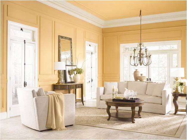
Design: Yellow is a ‘warm’ color, meaning it can actually help us feel warmer, change the perceived temperature of a room, and mimic sunlight in dark, windowless rooms and hallways, or in rooms with a Northern exposure or orientation. It will also seem to come toward you (Feng Shui’s “gathering” influence of Earth element). A light shade of yellow will make the room seem warmer yet larger, cozier yet brighter.
Yellow is also the first color we see when we look at a design (a room or graphic). It captures our attention. If you are designing a room and want to send the ‘eye’ in a particular direction, to highlight or to divert away from an unpleasant view or one straight out the window, use a bit of bright yellow to attract attention. You don’t need a lot, perhaps a yellow Gerbera daisy or a yellow frame, a citrine lantern (a crystal which will clear the space of negativity without having to be cleansed).

You don’t need a lot of yellow, just a yellow undertone in the paint will help bring a more full-spectrum, and therefore pleasant experience into the room. Yellow is what is called a “self-compounding” color, meaning that one wall of yellow will bring a little sunshine into your room, two or five walls (the ceiling counts) will reverberate yellow resoundingly into the space, making the yellow much louder. (Like the difference between having one child or one pet and having two or three–the effect increase exponentially.)
Kids and Yellow: Kids will usually choose the most ‘saturated’ colors on the paint display and many times parents will default to happy, joyful, clean colors for children’s spaces but think again!
Yellow is not recommended for spaces where we spend a lot of time and children are more easily influenced by their surroundings and colors. A lot of time spent in a yellow room has been shown to elicit a ‘colicky’ response in babies. (Colors impact our physiology and yellow is the frequency of our digestive energy center, the Solar Plexus energy vortex where nerves meet to fuel our digestion and connect our upper and lower energy centers, our motivation and will and our mental acuity. Get it? Solar=Sun=yellow)
Soft Yellow is a Great Color for Learning:
Pale version of yellow is great for mental accuracy and pale yellow can be very stimulating to thought processes and detail focus.
Below are some colors that offer a softness and a subtlety, that will allow the space to emit an energy of mental clarity but not over-do it or make folks cranky because too much or too saturated a yellow will tend to over-stimulate our senses.
With learning, it is also very important to have windows, natural light, sun-tubes to allow natural day-light harvesting, or at the very least, artwork that replicates the ‘long-view’ to allow our bodies the opportunity to visualize and see further into possibilities and not get overly grounded or hyper-focused on details and miss the bigger picture. Especially if this is in a Northern facing environment, with windows receiving the grey-er northern light, it will be important to have yellow as the undertone for the paint.
Some great learning colors:
Something like PPG Pittsburgh or Porter’s Soleil ATC 23 is very nice for learning, soft and yet happy. All of these colors are ‘tints’ which means that they are primarily the hue mixed with white (their color number begins with 100 or 200 in the PPG System). White will also add a bit of energy to the room, and from a Feng Shui perspective, white and pastels are Metal energy, which is great for mental acuity, conditional support and community endeavors.
Here are some others:
214-1 Satin Weave
111-2 Blonde Beauty
115-1 Combed Cotton
115-2 Soft Cream
114-1 Lotus Flower
114-2 Silk Sails
213-1 Candlewick
213-2 Crescent Moon
113-1 Moonshine
212.1 Cake Batter
212-2 Golden Fleece
112-1 Capri Cream
211-1 Clear Yellow
211-2 Bright Laughter
111-1 Sail Cloth
111-2 Blonde Beauty
111-3 Butter
Yellow is a happy antedote to dreary