Often one of the most forgotten surfaces in our homes is the ceiling, yet it is consistently one piece of architecture that dramatically influences how the room feels and looks.
A low white ceiling will feel like a lid, defining how high the box is in which we live, making us feel claustrophobic, impairing our ability to think clearly and creativity. (Ceilings & Behavior) But it’s not just the whiteness that affects us, it is also the difference between the ceiling color and the wall that affects our perception…and after all, that’s a big part of whether we feel happy and harmonious or not!
I believe most ceilings are painted white for a few reasons.
The outside of the can says “Ceiling White” and we think, “Oh, okay.”
We think that white goes with everything. Especially with paint, there are millions of different whites and they can make or break a rooms feel and color scheme. That’s another post.
Many of us hate to paint the ceiling because it’s not easy…my college roommate’s motto applies: “Laziness will prevail.” So we paint it white thinking we won’t have to change it each time we decide to change the wall color. But that’s so not true.
Ceilings: Too High, Too Low or Just Right!
Color is one tool we use to change our experience and perception. Line is another. How the room looks affects how we think and feel and how long we actually stay in the room. Interior Designers and Architects understand the language of space and color and use these cues to move traffic along through buildings and homes and now you’ll begin to understand a little of this as well.
Our eyes actually read space and define ourselves in space. The edge (or line created) between the wall color and the ceiling color is quickly read and defines for us the height of the ceiling.
Two ways to remedy a low ceiling with paint color:
1. Change the color and blur the line
Use the “same” color as the walls to make the ceiling ‘disappear’ (test, you may want to go just a shade lighter)
Use LIGHTER not WHITE
Ask the paint mixer to mix you the color that is 1/3 to ¼ lighter than the wall color. Be sure that you mix it from the same paint formula. Choosing a ‘lighter’ color from the stripe card will not necessarily be the same undertone and you could get a result you don’t want. You can go lighter than this and my recommendation is: test, test, test.
Ecru or Beige
If you don’t want a lighter version of green or red, try using a pale beige or ecru to soften the harshness of the ceiling.
Use a pale grey/blue which will imitate the sky to our perception. A color like PPG’s Stratosphere (348-2) is a beautiful choice.
Light blue/grey ceilings can fool our bodies into thinking it’s actually the sky. Use caution when choosing undertones. Photo courtesy of Janice Lindsey, PINK /colour & design
Be careful when using blues and greys though, because in this case undertones are subtle and can defeat the purpose. When choosing a blue/grey, be sure to hold it next to the wall color and check the undertones: does the blue appear greener or pinker? Does it make your wall color look too pink or too green? If so, chose another blue/grey that works better. (We learn all this in the Certified Color Specialist Training…as well as how to use this knowledge to grow your business.)
Other ways to raise a ceiling height:
Use upward shining lighting this will lift the ceiling
Replace the center-of-the-room light with a small chandelier on a dimmer, or use a fixture that shines the light upward
Lower the height of lamps to below ½ the height of the ceiling. This will draw the light boundary lower into the living space
Draw a line between ‘heaven and earth’ as the Chinese say in Feng Shui: Create an imaginary border by aligning the tops of paintings, artwork, a little lower than you normally would, even as little as 4” lower can make a difference and make the ceiling seem higher. It’s a method of distraction and perception.
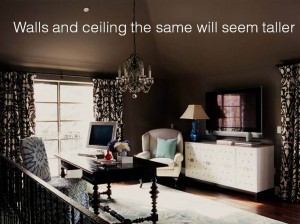
Even with darker ceilings, you can make the ceiling disappear by painting the ceiling and the wall the same color. This is especially useful in rooms that have dormers or oddly shaped ceiling heights. You can add drama, make it feel warm and cozy by painting the ceilings and walls the same color.
TIP: You might like your wall choice on a few of the walls and find it’s dreadful on one or more others. Rather than “live with it”, take some time to select a color that will “LOOK” the same as the one you love in the room in which you are using it. Light is an active participant in the color and changes the color we see. When you start to actually look at the colors on the walls in your spaces, you’ll notice there are myriad shades, not the out of the can one that you selected. Awareness and testing help you get it perfect every time.