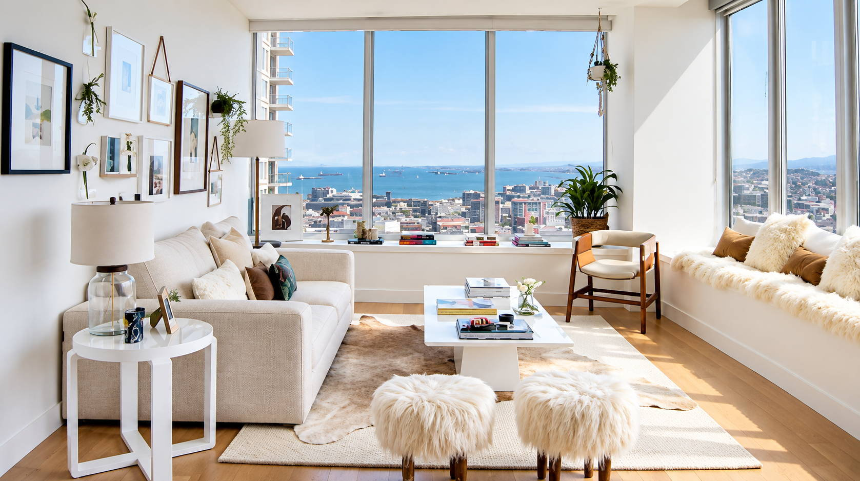
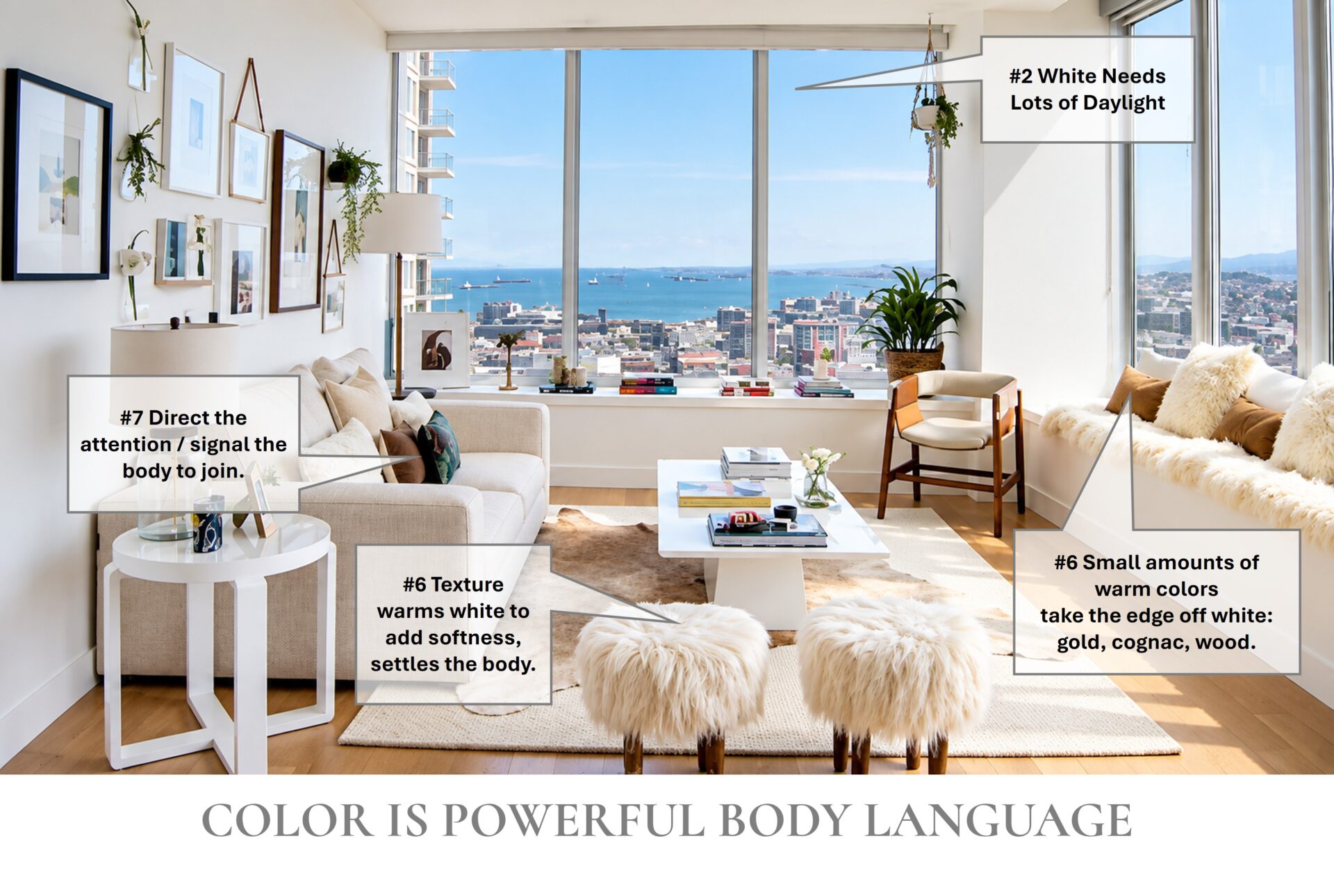
This room, photographed by Julia Sperling at JuliaSperling.com, does white well ... but WARNING: there is a dark side to white - read below.
If designing with white is your go-to, it’s important to know how white influences the body and our outcomes.
These tips will help you soften white’s impact, so your room supports you instead of wearing you down.
Designing with white is an advanced move.
White is beautiful, and many of us default to white for walls, trim and ceilings, but too much of a good thing – white – is not a good thing. Used with intention, it can give your body exactly what it needs, and you must know what white is delivering. Know that it’s likely not you having focus or error problems – it’s the color your body is constantly processing and adjusting to, and that’s what drains your energy. A few simple shifts can help you take charge when your body starts to be overwhelmed.
Unsoftened white doesn’t just wear you down; it can trip up your thinking.
In a study of 675 people working in offices painted one of nine colors
White
People liked the white offices best, and made the most proofreading errors there.4
Classroom color and design: a study of 153 classrooms in 27 UK primary schools
Nearly 2×
Students in the best-designed classroom made nearly twice the learning progress of students in the least effective one over 1-year period.5
A moderate level of visual stimulation supported learning best with walls neither too bright nor too dull.
At a glance
Designing with white is an advanced move that influences cognition and outcomes.
Balance the white with the time spent in the space; allow people to leave when the body needs to reset.
Understand the person’s lifestyle, and why they might need the medicine of white.
8 things to know about designing with white
The numbers match the tips below. Photo by Julia Sperling at JuliaSperling.com.
1
White is not a “blank canvas” and NOT the neutral that many believe it is. The white rooms we move into after the builder has left have been painted white for builder convenience (ceilings, walls, trim, doors) with the idea that those who move in will change the colors to suit themselves. That doesn’t often happen and the more we see something, the more we believe it’s “the way it is meant to be.” Not true.
Like snow in winter or on distant mountaintops, white is crisp and stark. White quickly activates our bodies. There is a balance to using white that must include the person, the time spent, and what needs to be accomplished in this space.
2
Have plenty of good natural light. White loves daylight, as in the room above. Northern exposures especially need a bit of yellow added to the white, to round out the gray or blue nature of the light coming into the room, and into our lives.
3
White makes everything more noticeable. White reflects nearly every wavelength of visible light back at us, where other colors absorb some. A bright white room can be a little like standing in the sun at noon – all that reflected light is a lot for the body to take in. After a short time, we look for shade, or what architecture and biophilic design call “refuge,”1 like the window seat in the photo above, a sheltered spot with a view. When surfaces are much brighter than our eyes need them to be, researchers find we experience discomfort glare: eye strain, squinting and headaches.2Over a short period of time, that constant adjusting adds up, part of what is called allostatic load, the wear and tear of continually adapting.3
4
Color changes how we perceive space. Color can make a room appear smaller or larger, hallways appear longer or more easily traversed just based on how the color is placed. Architects have long built their models in white because removing color lets them focus on the spatial relationships of a building, its massing and the play of light and shadow. Add color and the space looks and behaves differently.6
Example: look at the room in the photo above, and notice where your eye goes as you scan it. Because the ceiling and base trim are the same white as the walls, the room looks taller, those lines disappear, so the read of the room is different: the room appears to be and feels taller, which balances its length…a long narrow room, or a short, tall room are both uncomfortable to the body. NOTE: Color drenching and color blocking is not always the answer and often a lost opportunity to speak the body’s language.
5
White shouts. Place white next to any color, and you’ll notice the white first and the other color will appear more muddied. So you don’t end up hating your room and wanting to replace the carpet, seating or window treatments, test the colors before you commit, select a white that is warmer.
Select White Carefully. There are thousands and thousands of “whites.” Each one has undertones that can make even whites fight with each other. When designing with white, select whites the same way you would select any other color, making sure their undertones align.
Warm it up. Texture gives the body a sense of warmth, and here’s the secret: we see texture through highlight and shadow. That play of light and dark is what makes a white room feel soft, touchable and alive. Notice the sheepskin, fur stools, cowhide and linen in the room above. That’s white plus warmth. Small amounts of warm colors direct the eye and also take the edge off white: gold, cognac and wood.
7
Give the body a sense of place. Place accents at three points around the room, and give furnishings and art space around them, so the brain and body can read the room without exhaustion. In the photo, the gallery wall, cognac chair and the legs on the stools serve as contrast that directs attention and signals the body to join. Know that a black-and-white scheme tends to polarize thinking and also invite the room to settle into gravity.
8
Find the right balance: how much, and for how long. I had a client whose lifestyle included two homes, one in New York and one in the Caribbean. Her New York apartment was the perfect recipe for focus in the high-vibe New York environment: minimal, with abundant negative space (what artists call “white space”), so she could stay clear for the short time she was there. Having a colorful, natural home to return to in the Caribbean was what restored her, her creativity and her functional health.
Another client asked for her mountain cabin to be all white, with wood floors and ceilings, and I loved creating it with her. The wood flooring and ceilings warm nearly every room, larger windows allow more light and more Nature into the spaces. She visits for short, restful stays, and it suits her aesthetic and life perfectly.
Is your white working?
Signs it’s working: you feel clear and focused, and you can still settle and rest in the space.
Signs it’s time for a color change: behavior turns rigid, cold, unrelenting or dictatorial.
How long to watch: 2 weeks to 2 months.
Check in with your body
Whatever you choose when designing with white, watch the people and their behavior for 2 weeks to 2 months. If you appear to be struggling, tired, cranky or making more mistakes than you’d like, check in with them and notice your own body and don’t immediately blame yourself or those in the space, often times it’s what is or isn’t in the room that your body is sending you signals about.
The Dark Side of White
Too much of a good thing is not a good thing.
This last part is sobering, and I share it with care. It shows just how deeply the body reads the space around it, and why every one of the tips above matters.
At the far extreme, an all-white world has been used as a weapon. “White torture” is a documented form of sensory-deprivation torture: white walls, white clothes and white light around the clock.78
How long do you or the others spend in this white space and are they able to leave at will? When color, contrast and variety are missing, and the body cannot leave to seek what it knows you need, the body does not read “calm” it succumbs to stress. Bodies know and need a readable, varied environment.
NOTE: Color is Medicine for our lives, but we are NOT diagnosing anyone.
When we understand neuroarchitecture and design to speak the body’s language, our job is to share what we know and collaborate toward a beneficial final decision, which is always theirs. Check in with them in 30–60 days, and you will be serving them well.
Resources
Appleton, J. The Experience of Landscape, 1975. Introduced prospect-refuge theory: we are drawn to places where we can see out (prospect) while feeling sheltered (refuge).
“Harnessing daylight strategies for maximizing visual comfort in architectural design studios.” Frontiers in Built Environment, 2025. Summarizes research showing that discomfort glare, caused by localized bright areas, triggers eye strain, squinting and headaches.
McEwen, B. S. “Protective and damaging effects of stress mediators.” New England Journal of Medicine, 1998. Defined allostatic load: the cumulative wear and tear on the body from repeatedly adapting to demands.
Kwallek, N., Lewis, C. M., Lin-Hsiao, J. W. D., and Woodson, H. “Effects of nine monochromatic office interior colors on clerical tasks and worker mood.” Color Research and Application, 1996. In this study of 675 participants working in offices painted one of nine colors, the most proofreading errors occurred in the white offices, even though participants liked those offices best.
Barrett, P., Davies, F., Zhang, Y., and Barrett, L. “The impact of classroom design on pupils’ learning: Final results of a holistic, multi-level analysis.” Building and Environment, 2015. A study of 153 classrooms in 27 UK primary schools, which found that classroom design accounted for 16% of the variation in students’ learning progress over a year, and recommends a moderate level of visual stimulation, avoiding extremes of brightness and dullness.
“White Architectural Models.” Model-makers.co.uk, 2023. Explains that white models remove the distraction of color so architects and clients can focus on form, shape, spatial relationships, massing, and light and shadow.
“Iranian exile speaks out on colorless ‘white torture.'” CNN, October 29, 2008. Amir Fakhravar’s firsthand account of his all-white cell in Iran.
Amnesty International, on the case of Amir Fakhravar, 2004. Documented his detention and the sensory-deprivation conditions he endured.
Photograph courtesy of Julia Sperling, JuliaSperling.com.