If designing with white is your go-to, it’s important to know the ins and outs so you feel wonderful in the space.
Designing with white is an advanced move, because WHITE also has a dark side. Read on.
White is beautiful, and many of us default to white for walls, trim and ceilings. Used with intention, it can give your body exactly what it needs. But you must know what white is delivering, so you can tell whether it IS working on your behalf.
8 things to know about designing with white
1
White is not a “blank canvas.” Nor is it the “friendly neutral” that many believe it is. Not by ANY means. Like snow in winter or on distant mountaintops, white is crisp and stark. It quickly activates our bodies and puts us on the knife’s edge, and just like the surgeon’s knife, it can help us cut through, meet deadlines and be inspired toward commerce, honor and duty. All good things, of course. Yet too much of anything is exhausting to the body.
2
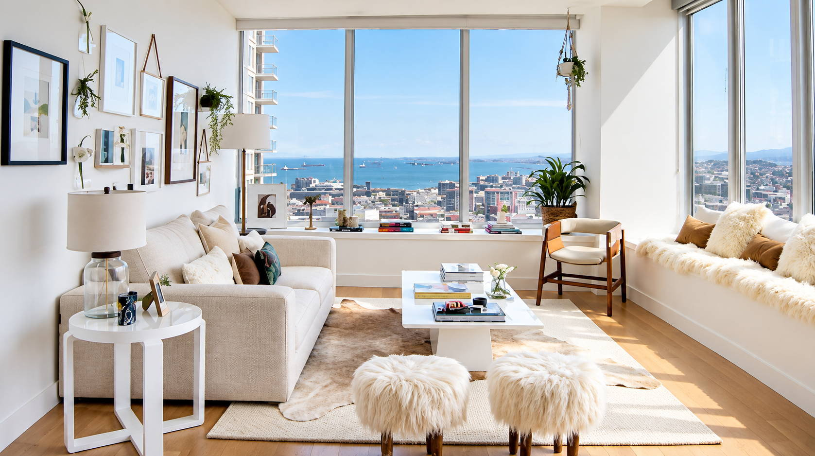
Have plenty of good natural light. White loves daylight, as in the room above. Northern exposures especially need a bit of yellow added to the white, to round out the gray or blue nature of the light coming into the room, and into our lives.
3
White makes everything more noticeable. White reflects more light than any other color, so it spotlights everything in the room, and our eyes and bodies take in all of it. In one study of 675 people working in offices painted different colors, people made the most proofreading errors in the white offices, even though they liked them best.
1 In classrooms, researchers studying 153 classrooms advise avoiding walls that are too bright or too dull: a light, calm color with an area of brighter color works well.
2
Place white next to any color, and you’ll notice the white first and the color second. White also makes muted colors look dingy and dull. So you don’t end up hating your room and wanting to replace the carpet, sofa or chairs, pair white walls with crisp versions of your accent colors. Better yet, use blue, which pairs well with white because of the way our eyes read it.
4
Color changes how we perceive space. Used strategically, color can make a room appear smaller or larger, and make walls advance or recede. That’s why architects have long built their models in white: removing color lets them focus on the overall form, shape and spatial relationships of a building, including its massing and the play of light and shadow.
3 It’s also why white shows every flaw and exaggerates proportions, so be sure the walls and layout are right before you choose it.
Now look at the room in the photo above, and notice where your eye goes as you scan it. Because the ceiling and base trim are the same white as the walls, those lines disappear. The room feels taller, which balances its length, and the visual clutter falls away.
5
There are thousands and thousands of “whites.” Each one has undertones that can make even whites fight with each other. When designing with white, select whites the same way you would select any other color, making sure the undertones align. You can learn how to do this with confidence in
The Gentle SHIFT Academy.
6
Warm it up. Texture gives the body a sense of warmth, and here’s the secret: we see texture through highlight and shadow. That play of light and dark is what makes a white room feel soft, touchable and alive. Consider using warmer whites rather than a white with a stark blue or gray undertone, and warm it up even more with burnished gold.
7
Give the body a sense of place. Place accents at three points around the room, and give furnishings and art space around them, so the brain and body can read the room without exhaustion. Know that a black-and-white scheme tends to polarize thinking and relationships, so everything is seen as “black and white.” That can help someone who struggles to make decisions or gets lost in details, but watch for behavior changes, which usually show up within 2 weeks to 2 months.
8
Find the right balance: how much, and for how long. I had a client whose lifestyle included two homes, one in New York and one in the Caribbean. Her New York apartment was the perfect recipe for focus in the high-vibe New York environment: minimal, with abundant negative space (what artists call “white space”), so she could stay clear for the short time she was there. Having a colorful, natural home to return to in the Caribbean was what restored her, her creativity and her functional health.
Another client asked for her mountain cabin to be all white, with wood floors and ceilings, and I loved creating it for her. She visits for short, restful stays, the wood warms every room, and the windows fill it with forest and sky. That’s the difference between a white room and a white choice.
The spaces we create are a balance for what we experience in life outside those spaces: in how we approach our work, our relationships, and even our locales and geographies, even our internal experience of life.
The Dark Side of White
This next part is sobering, and I share it with care. It shows just how deeply the body reads the space around it, and why every one of the tips above matters.
If white were truly neutral, it would be harmless in any amount. It isn’t. At the far extreme, an all-white world has been used as a weapon. “White torture” is a documented form of sensory-deprivation torture. Former prisoner Amir Fakhravar described his cell in Iran to CNN: white walls, a white floor, white clothes, white light 24 hours a day, and white rice as his only food. He heard no voices and saw no color.4 Amnesty International documented his case in 2004 and said conditions like these appear designed to weaken prisoners, and Fakhravar said the beatings he endured were nothing compared with it.5
Your white kitchen is not a prison cell, of course. But the same body lives in both places. When color, contrast and variety are missing, the body doesn’t read “calm” or “nothing.” It reads absence, and absence is information.
Check in with your body
Whatever you choose when designing with white, watch behavior for 2 weeks to 2 months. If it turns rigid, cold, unrelenting or dictatorial, it’s time for a color change. Check in with your body, your behavior and your relationships often, and notice how your life is going.
Takeaways
- Designing with white is an advanced move.
- Balance white with the time spent in the space.
- Understand the person’s lifestyle, and why they need the medicine of white.
Color is medicine for our lives, and more. But we are not diagnosing anyone.
Our job is to give people what they ask for, share what we know, and let them decide for themselves. When they have questions, we answer. When they’re ready, we deliver.
Change your spaces and you will change how much love, time, health and joy you have in your life.
Originally published in July 2022; refreshed with current research.
Resources
- Kwallek, N., Lewis, C. M., Lin-Hsiao, J. W. D., and Woodson, H. “Effects of nine monochromatic office interior colors on clerical tasks and worker mood.” Color Research and Application, 1996. In this study of 675 participants working in offices painted one of nine colors, the most proofreading errors occurred in the white offices, even though participants liked those offices best.
- Barrett, P., Davies, F., Zhang, Y., and Barrett, L. “The impact of classroom design on pupils’ learning: Final results of a holistic, multi-level analysis.” Building and Environment, 2015. A study of 153 classrooms in 27 UK primary schools, which found that classroom design accounted for 16% of the variation in pupils’ learning progress over a year, and recommends a moderate level of visual stimulation, avoiding extremes of brightness and dullness.
- “White Architectural Models.” Model-makers.co.uk, 2023. Explains that white models remove the distraction of color so architects and clients can focus on form, shape, spatial relationships, massing, and light and shadow.
- “Iranian exile speaks out on colorless ‘white torture.'” CNN, October 29, 2008. Amir Fakhravar’s firsthand account of his all-white cell in Iran.
- Amnesty International, on the case of Amir Fakhravar, 2004. Documented his detention and the sensory-deprivation conditions he endured.
- Photograph courtesy of Julia Sperling, JuliaSperling.com.
- Learn to choose whites and whole color palettes with confidence in The Gentle SHIFT Academy.