When designing with kids, they listen to their hearts and will most definitely select the most vibrant color in the palette for their walls. Fire Engine Reds, Bright Sunny Yellows or even Bluer than Blue are the ones they’ll request to be surrounded with.
Although kids are drawn to primary colors, don’t do it! Their developing eyes are drawn to those colors, that’s why they choose them: they can SEE them.

Bright colors are fun but wreak havoc on little bodies and parents’ nerves. More than just a tiny bit of these bright colors will overstimulate children, deprive them of their own ability to soothe, rest fully, sleep deeply and awaken refreshed. Bright and highly saturated colors used in a play room can cause arguments (reds are activating), indigestion and irritability (yellow) and anxiety (highly vibrant blue).
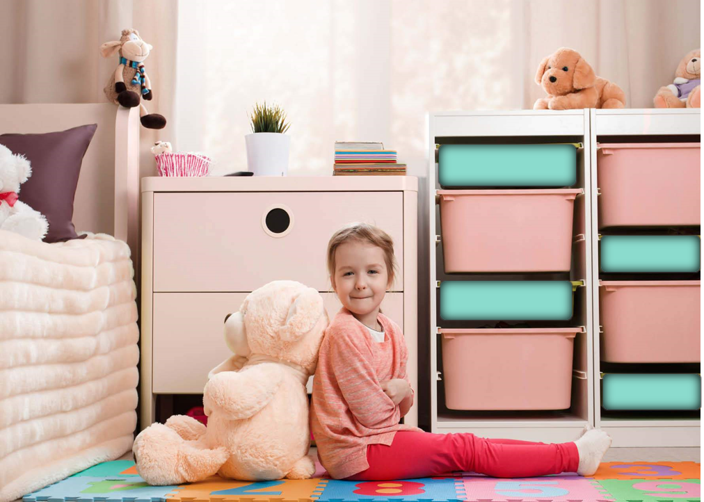
The best tip: avoid bright primary colors in a room or learning space, as these colors will overstimulate the body and lead to exhaustion. A little bit of color goes a long way. Choose a soft version of the color and only use small bits of brights to direct attention and if possible, store it away at sleep time.
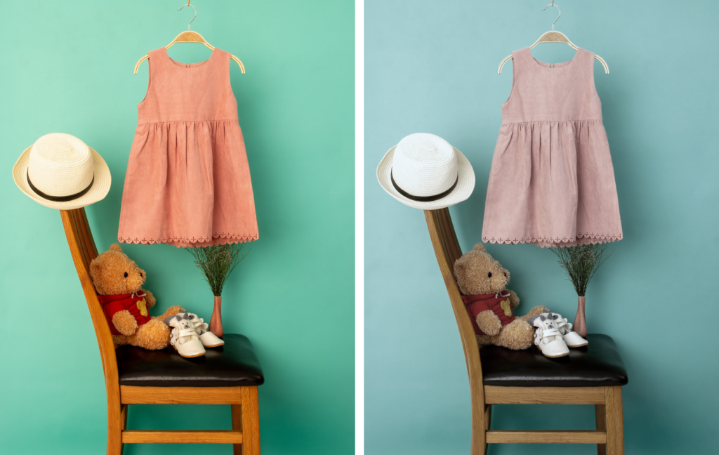
Which one feels calmer? Notice the difference in the two images below and how you feel. This is how the body reads colors. If you and your child love the aqua and coral color scheme, make it more muted for a wall color in a a room in which they’ll study or sleep. If you both LOVE the aqua and coral, use these colors as PART of the overall color scheme and the result will be a happier child and family.
Important tip: paint the ceiling and the trim the same soft color as the wall color. White ceilings can make life seem out of range for little ones and can be overly stimulating and white trim is visual clutter which adds to the body’s stress level.
BE VERY AWARE OF Lighting
Soothe babies with muted tones. Use very soft colors – non-white pastels to ease them into the world as their vision develops.
Babies eyes first respond to faces, eyes and smiles and the contrast provided by black and white. Small visual cues and few but well-placed contrasting accents will help the neural pathways forming in their brains. Use just a little to avoid over-stimulating the little baby body.
Giving kids the ability to make decisions in their own spaces, while continuing to guide them is important.
At each age of our lives, our color needs and preferences change. For instance, between 0 and 1 we need high contrast in order for our brains and neural pathways to develop. As we age we also need greater contrast to guide us, helping us to distinguish between subtle variations important to distinguish stairs, level-changes, doors, and more.
Although young children are drawn to bright primary colors, it’s because they can SEE them, so of course they select them. As eyes develop, around 4-10 children are drawn to secondary orange, purple or greens. As we grow and are “educated” we are drawn to more complex colors. Teens are drawn toward darker colors, often black, which help them feel protected and help differentiate from their parents. I recommend allowing teens to have a bit of black in their color scheme, though not too much, perhaps a black-board paint on one wall or a well-placed color block or stripe.
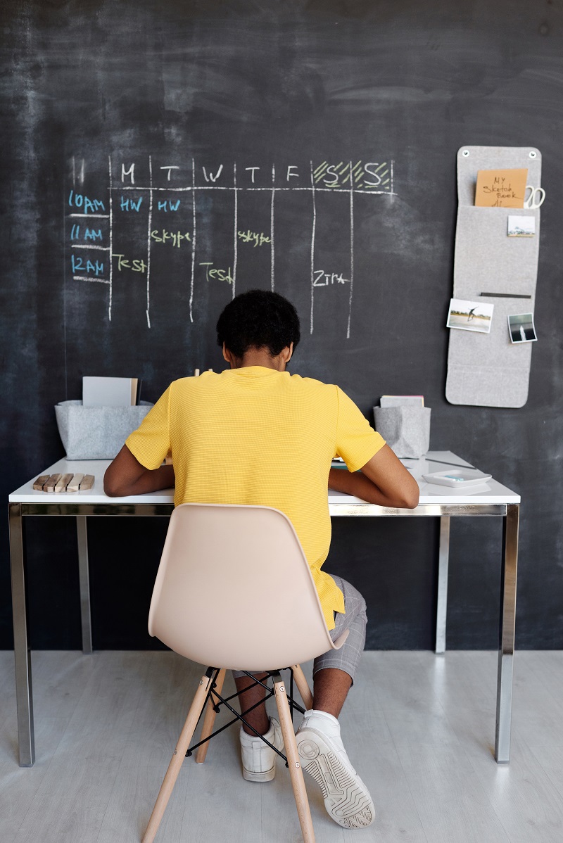
This young man is not in the “power position” and this will lead to stress, lack of focus and inability to be effective. Turn so that the child is facing the room, or place a mirror so that what is behind is reflected and seen.
Selecting a color palette for your family’s health is easier when you know how color influences behavior. The right colors will nourish everyone and help them lead a healthier, happier, more fulfilled lives.