Get into Green: Pantone Color fosters Growth, Prosperity and Health for 2013
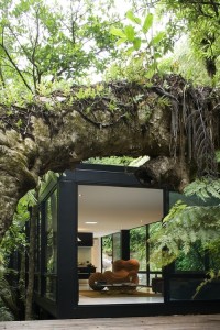
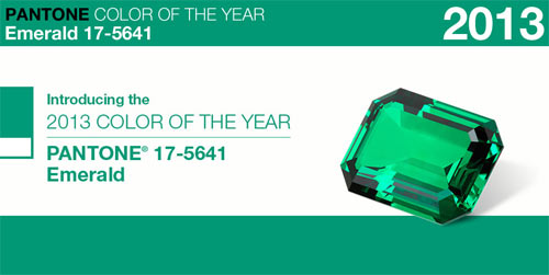
2013 Pantone Color of the Year: Emerald
This year, Pantone announced the color that we are needing, based on what they see on runways from designers, our economic climate and our global social environment is…drum roll…(doesn’t work so well in print) Emerald.
“Green is the most abundant hue in nature—the human eye sees more green than any other color in the spectrum,” Leatrice Eiseman, executive director of the GPantone Color Institute, said in a press release. “It’s also the color of growth, renewal, and prosperity—no other color conveys regeneration more than green. For centuries, many countries have chosen green to represent healing and unity.”
Growth, health and prosperity, sounds good to me!
Ways to Use Green
Customers will be wanting to use this beautiful, healing, inspirational color as they will begin to see it all over the place. Pantone, global leader in color marketing and matching, each year announces a Color of the Year and each season announces color palettes that tend to define the colors manufacturers select for their products.
How does this impact you and your clients? Consider this: What color do you remember popping up all over the place last year? Did you find yourself attracted to rich, motivating, social oranges? Did you see it perhaps in fabrics, accessories, even clothing? That’s the power of Pantone’s color of the year which is based on research about who we are and what we need, what color will motivate us in the direction we are wanting to go. Where you and your clients fall in what marketers call the Product Diffusion Curve, you’ll understand which clients want what’s new and which you can sell from the back of your stock.
Here’s a great blog post from SHAPE magazine about 5 FUN ways to use green…I love this post.
Feng Shui of Green
Green is the color in Feng Shui associated with wealth, prosperity and Tree energy…upward moving, independent and visionary. Green in bedrooms will create independence and relaxation because it inspires us to focus on movement, growing ourselves and ideas — it’s not what you want to use to create intimacy and partnership (use flesh tones for that–beige to cocoa–Earth colors). Green used in bathrooms is highly recommended in Feng Shui as it will uplift the downward flow of water energy and help to increase wealth, at least help you keep more for yourself!
Paint the Town Green: or just your walls
Using Green in your client’s rooms will help them experience freshness and health and be inspired to rest. Emerald is a specific color, but when choosing green, be sure that you have all the other items and colors in the same room so that you can be sure the colors and lighting will work together well. After all, Pantone is setting the color ‘tone’ (Pantone actually translate to ‘all colors’) with the color rich green, an emerald being a precious gem. Remember, names have significance when customers are choosing colors.
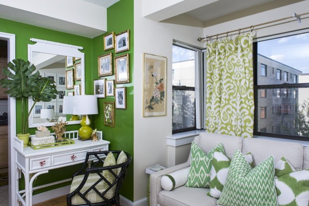
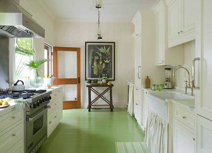
Green is often paired with white for a crisp, tropical feel, as in this room by Skyla Freeman published in the Washington Post Online.
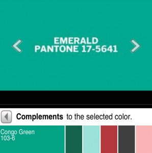
Pull your color swatches and check out Emerald–it is PPG’s Congo Green. What do you think? Does it match what you see on the screen?
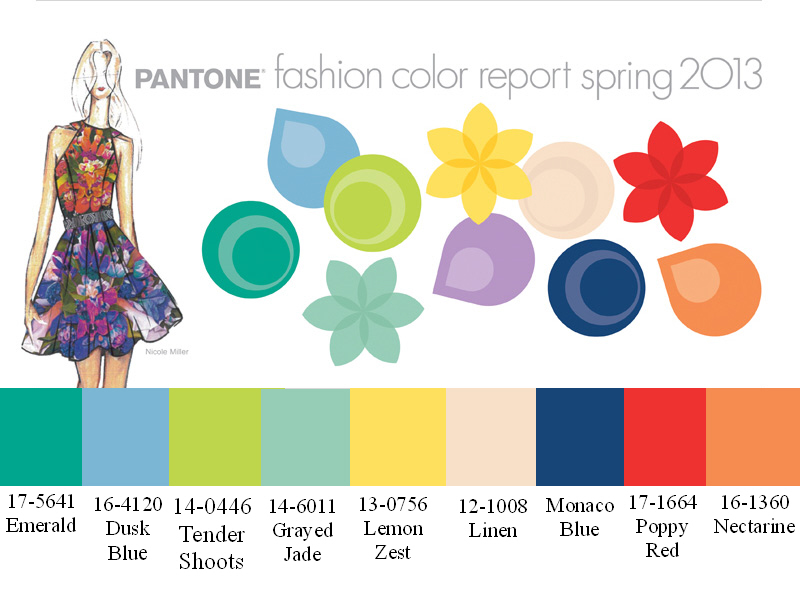
Here is a rich palette offered by Pantone for Spring 2013:
Notice the freshness and spirit active through these colors. Pantone recommends colors for all industries, from fashion to home interiors, vacuum cleaners to coffee pots and, shoes to speakers. When we are looking at home interiors, fabrics, furnishings, fixtures and wall colors, we’ll want to limit the palette to 3 to 5 colors, which include all the items in the room’s portrait.
Take the cue from either your room or from the fabric itself. The fabric manufactures have taken the guesswork out of choosing colors for the most part…use the fabric as the color scheme hero and you can’t go wrong.
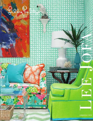
Lily Pulitzer for Lee Jofa brings an upscale and current twist to 2013 and interiors with her line of home interior fabrics.
Green can be paired with just about any color, depending on—you got it!—it’s undertones.
Green and white gives a fresh, tropical look, but as you can see, this photo doesn’t quite look like the image of Pantone’s colors. That’s why it’s very important to have fabric and paint samples, etc. together in the room you are designing when you select your colors.
Notice the subtle color shift
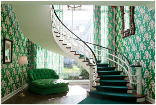
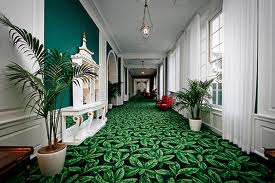
2013’s color trends, and Emerald, have a very different feeling than the one used in traditional color schemes. Dorothy Draper is famous for using many bold and rich colors in her decor. If you have the opportunity to visit The Greenbrier Hotel in West Virginia or The Grand Hotel in Mackinac Island, you’ll be living with this legend’s wealthy, colorful decor.
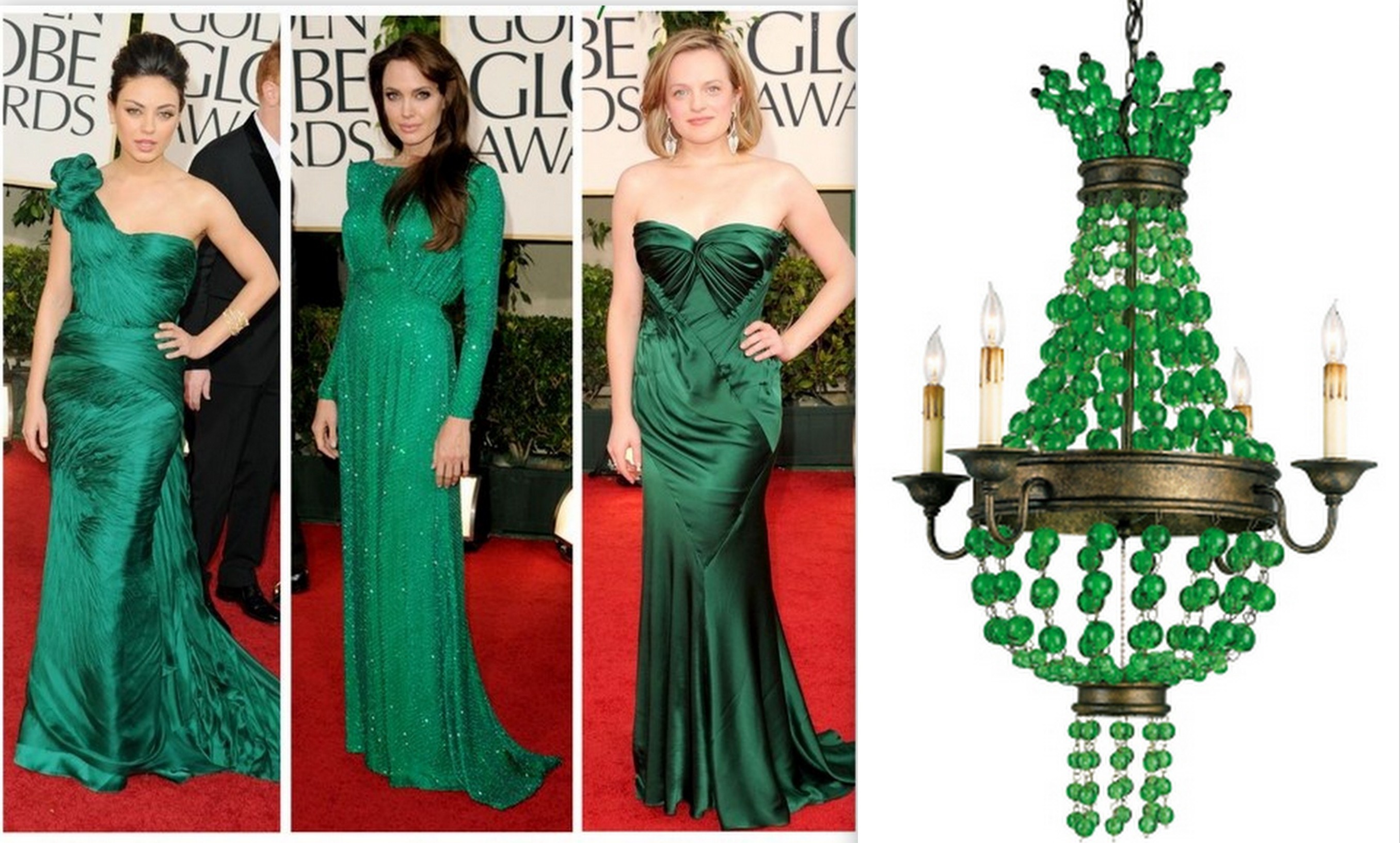
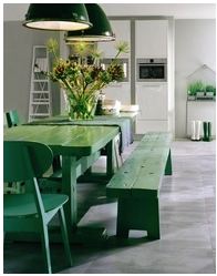
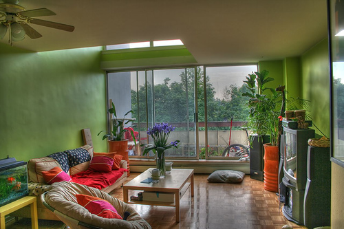
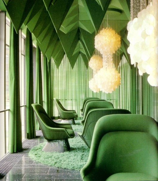
Other Ways: Green or Emerald in Decor
Table of Contents
Categories
- Bedroom Design
- BioGeometry
- Body — Mind BODY Spirit Space
- Body's Design Needs to Thrive
- Bringing Beauty Back
- Business
- Color
- Color & Design
- Color Psychology
- Cool Stuff – Technology and Nature
- Creating Your Dreams
- Design for Health
- Design for Human Response
- Design to Thrive
- Embrace the Darkness Project
- Energy Update
- Family
- Green Living
- Health
- Healthy Home
- Healthy Work
- Home Buying & Selling
- Law of Attraction
- Life
- Life Surfing
- Mind
- Office Success
- Real Estate
- Sleep
- Space
- The Gentle SHIFT
- Trends
- Uncategorized

